Behind-the-Scenes with CamelBak's Color and Trend Forecasting Expert
What Does Your Water Bottle Say About You?
Do you match your bottle to your bike frame? Do you prefer a pack with a pop of color or opt for something more neutral? You likely don’t make those decisions off the cuff and neither do we.
A lot goes into choosing the right colors for your gear. In fact, our design team spends countless hours carefully considering what feelings and emotions these colors evoke, and how they can help inspire you to find your flow in the outdoors. One person in particular is in charge of all things color here at CamelBak, so we sat down with her to learn a little more about what goes into selecting our favorite hues.
About Anna
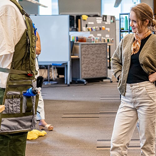
Anna Binnewies has been in the color and trend forecasting industry for over a decade. She's currently the Manager of User Research, Color, and Trend at CamelBak, where she's responsible for choosing the colors of all of the company's products.
With a professional artist for a dad and a design-minded mom, Binnewies has been around the creative process her whole life. She studied art and architectural history in college, where she also explored her interests in psychology and anthropology. Shortly after college she found a place for both her creative passions and research-based interests in this profession.
A former college athlete who grew up exploring the California coastline and towering mountains of the Sierra Nevada, Binnewies also loves spending time outside. She’s a long distance runner, camper, backpacker, and cyclist. The outdoors have always played a powerful role in her life. Somewhere along the way she realized she could work in the outdoor industry and put her skills to use in pursuit of the activities she’s passionate about, at CamelBak.
How Binnewies Draws Inspiration from Nature
Binnewies says that she loves to draw inspiration from nature when she's choosing colors. She often goes for walks in the park or hikes in the mountains to see what colors are around her. She also takes inspiration from flowers, plants, and other natural elements.
How Binnewies Conducts Research
In addition to drawing inspiration from nature, Binnewies also conducts research to learn about what colors are popular and what colors are trending. She looks at fashion magazines, art galleries, and other sources of inspiration to see what colors are being used in different industries.
How to Predict Future Trends
Binnewies also predicts future trends when she's choosing colors. She looks at things like social media, pop culture, and current events to see what colors are likely to be popular in the future.
How Binnewies Uses Color to Inspire People to Get Outside
Binnewies says that she wants to use color to inspire people to get outside. She believes that color can be a powerful tool for creating a sense of adventure and excitement. She also believes that color can help people connect with nature.
Favorite Color Combinations
“It’s been a real dream for me to be here at CamelBak, where I have the chance to fuse those two worlds of art and the outdoors,” Binnewies says. “I’m sure most people don’t think about color as much as I do, but it can be a powerful tool to layer on top of our product design. But the power of color really can’t be overstated. I think of it as a subtle lever that can do some heavy lifting. Especially now that we’re living in more of an online space. Color has changed in a lot of ways. I feel like it almost needs to be a little more striking and jump out visually through photography more than ever before.”
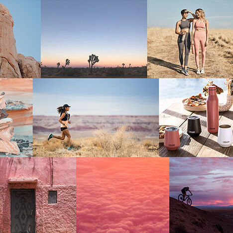
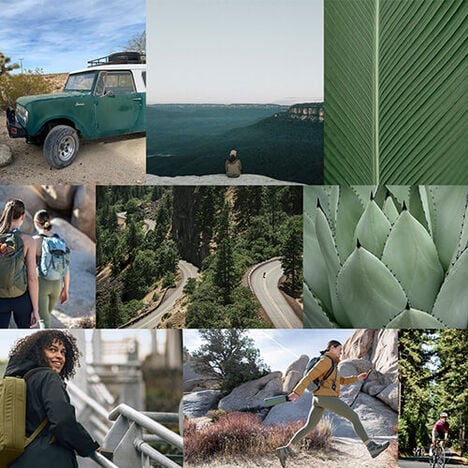
When asked to describe her process for drawing ideas from nature, she says running helps her see things differently. “On weekday mornings I’m trail running up in the Headlands, it’s where I do most of my initial concepting,” Binnewies says. “It’s my quiet time to be reflective and think about everything I’m processing in regards to research and global trends. Sometimes, I’ll be running in this beautiful landscape and all of a sudden something will stop me. I’m always dissecting the palette of the scenery around me. I ask myself questions like, ‘what colors are making this composition all come to life?’ or, ‘what’s inspiring me at this moment? I take a lot of photos. I try to bring some of that inspiration to my work.”
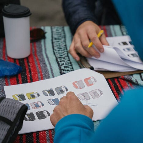
Binnewies doesn’t just draw that inspiration from the outdoors, a big part of her job is to research and conduct interviews and surveys of athletes and amateurs alike.
“I talk to our community and athletes, and I really try to get into their heads. I want to understand their emotional mindsets. It’s important to learn what drives them,” Binnewies says. “I take what I learn and bring that into the colors we use to try and evoke that same sense of wonder and inspiration they feel when they’re out there. The goal is always simple. Just get people stoked to be outside.”
Figuring Out The Future
One of the most difficult tasks Binnewies has is trying to predict the future. She’s often planning years in advance, and it’s tough enough to imagine what the world will look like tomorrow, let alone in 2025. Binnewies casts a wide net to try and get a pulse on what’s happening in the world, and what we can expect people to gravitate toward in the future.
“I’m looking at everything from art to fashion to music and then figuring out how that will trickle into the outdoor community,” she says. “I also pay attention to what’s going on in the sports world — especially biking and running. Because I’m doing these five year color trend plans, I really need to think about how these colors will resonate with people.”
Along the way, Binnewies and the team sometimes discover something unexpected. They find that although we might have a preconceived notion of what people want, a few conversations with cyclists can change everything.
“We used to think people wanted to match the bottle to their jersey, but one interesting thing we learned over the years of working with our athletes was that although that might sometimes be true, it’s really all about the bike. The bike is the tool. The bike rules,” Binnewies says. “So people either want something to completely match their bike frame, or they want it to disappear into the background to let the bike stand alone and really shine. We’re cyclists ourselves so we go into this process with our own ideas about what we like, but it’s really cool to have this kind of insight as we start to determine our color strategy.”
How Color Comes Together
Once the research is completed and the data has been analyzed, the next step is to determine the initial concept and create a cohesive color palette out of the inspiration she’s sourced. We asked Binnewies to describe her creative process when developing new gear and reviewing potential colorways:
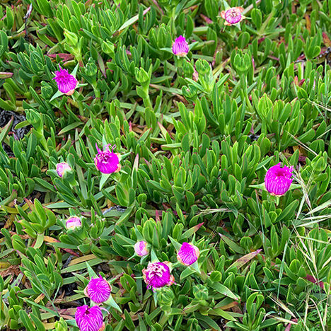
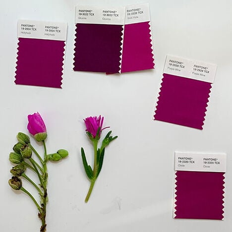
“We have this big open creative design studio where all of our designers build prototypes, where all the samples are shipped, and where we do our color reviews. I have a little tiny room off that space that I use as my sort of war room. A lot of my job involves traveling to different markets to see what’s happening in art, fashion, and textiles. I have pin boards up all over the walls filled with photography. I buy inspirational samples too. We were in a vintage kitchenware shop in London and I found this amazing old saucepan, and we took it back, cut it in half, and used that as inspiration. When we did the Point Reyes collection, I was picking flowers from this coastal succulent that blooms in the spring and I was matching the colors of the petals to their Pantone color. Sometimes it’s an actual piece of nature, sometimes it’s a found object.”
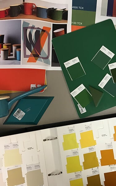
“I also look at athletic events like the Sea Otter Classic and ask myself, ‘what are some trends we’re seeing in bike frame colors?’ or ‘What are runners wearing at the UTMB World Series?’ From there I pull all my images and inspiration together. Once it's all concepted in my head, then I go into my Pantone color library and start to pull color standards that will fit what I’m envisioning. That’s when it gets more tactile. I lay out all the palettes I’m evaluating and start pulling together color combinations.”
“We were in a vintage kitchenware shop in London and I found this amazing old saucepan, and we took it back, cut it in half, and used that as inspiration.”
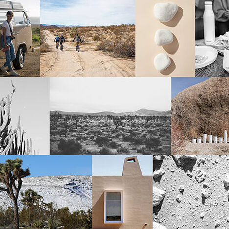
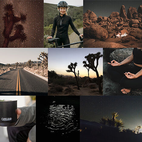
“But simultaneously, I’m also working through bigger questions like, ‘what are the main themes of the year?’ For example, something we’re seeing over the next few years is a trend of people preferring two families of color: either very calming, mindful, soothing colors to try and alleviate the stress of the world, or bright, bold, invigorating colors that inspire them to get back out into the world. That’s something that’s reflected in the palette of our Baja collection.”
“We have these really calming dusk and lagoon blues that are grounded in the sky and the deep sea. They’re colors that are really reassuring. But then we also have the wild strawberry color which is a spicy agua fresca that’s pretty wild and bright and joyful.”
The Power of Color
Color can have a huge psychological impact on us and it’s something Binnewies is hyper-aware of when she and her team are trying to hone in on just the right hue.
“Color has a really deep emotional influence on people. It’s easy to get swept up in color trends. But there’s subtle meaning and psychological significance behind a lot of colors. Blues generally remind us of the water and sky which are generally universally thought of as calm. There have been studies that show the color red increases heart rate. It’s something to think about as we decide where and when it gets applied. Since CamelBak gear is used by athletes all over the world, there are cultural implications of color that we consider too.”
Looking Ahead
What’s next for CamelBak when it comes to color? Binnewies is excited to start telling a story that spans across categories.
“Something we’re looking at in the future is how all of these color choices live together in a cohesive way,” Binnewies says. “When you buy something from CamelBak we always want to make sure that the colors are inspired by natural elements, guided by our sustainability principles, and that it’s going to be something that helps you find your flow state. The colors are active, dynamic, and inspiring. No matter what category we hope that shines through.”
